Zesty
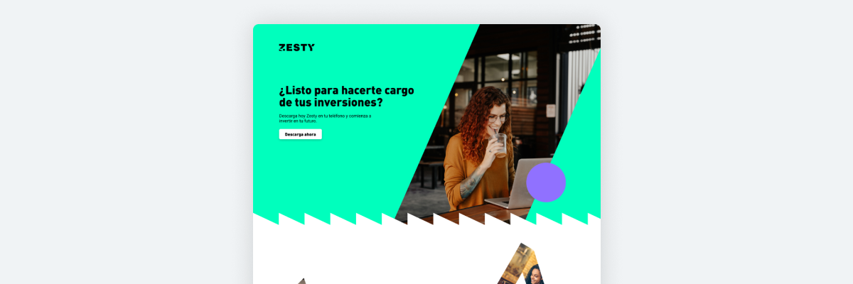
Zesty is an innovative start-up based in Chile that offers its users an online platform for investing in stocks, cryptocurrency, and ETFs. As a UX designer and frontend developer, I was approached by one of the founders to design and code the landing page for the platform, along with transactional and informative email templates.
Role
- UI Designer
- UX Designer
- Graphic Designer
- Frontend Developer
Duration
- ~12 months
Tools
- Figma
- Figjam
- VS Code
- Stripo
Deliverables
- Responsive Landing Page
- Responsive Mailings
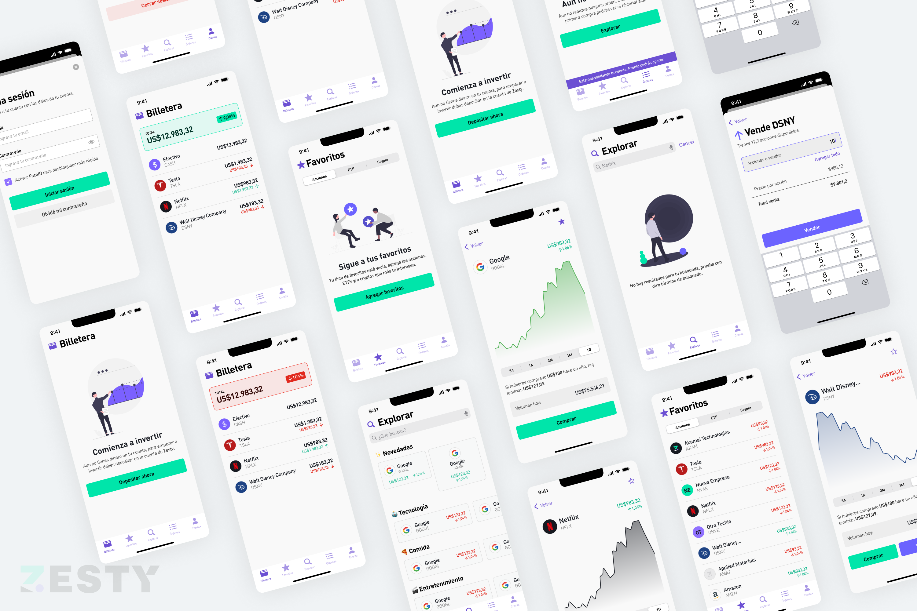
- App Design
Landing Page
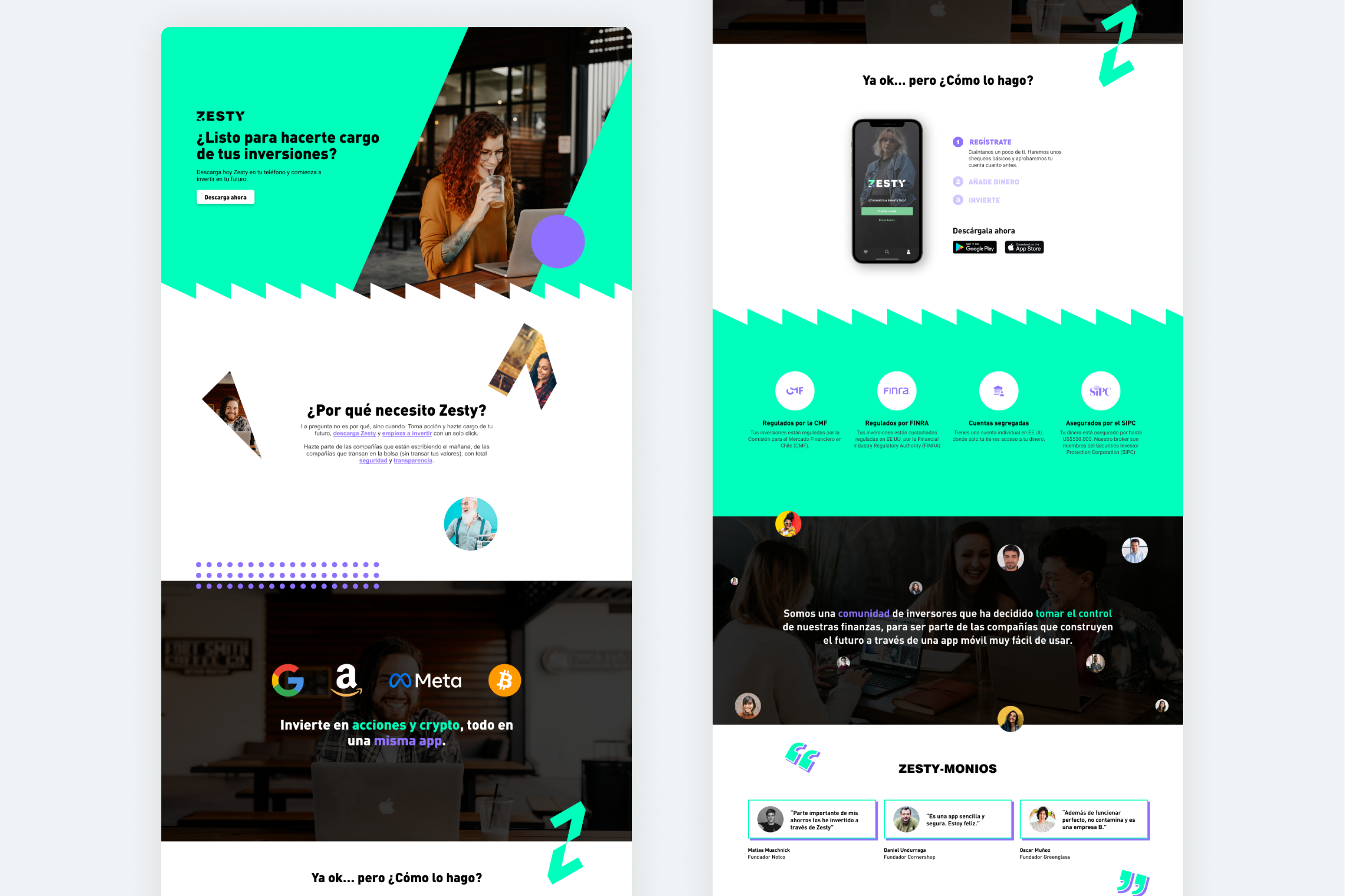
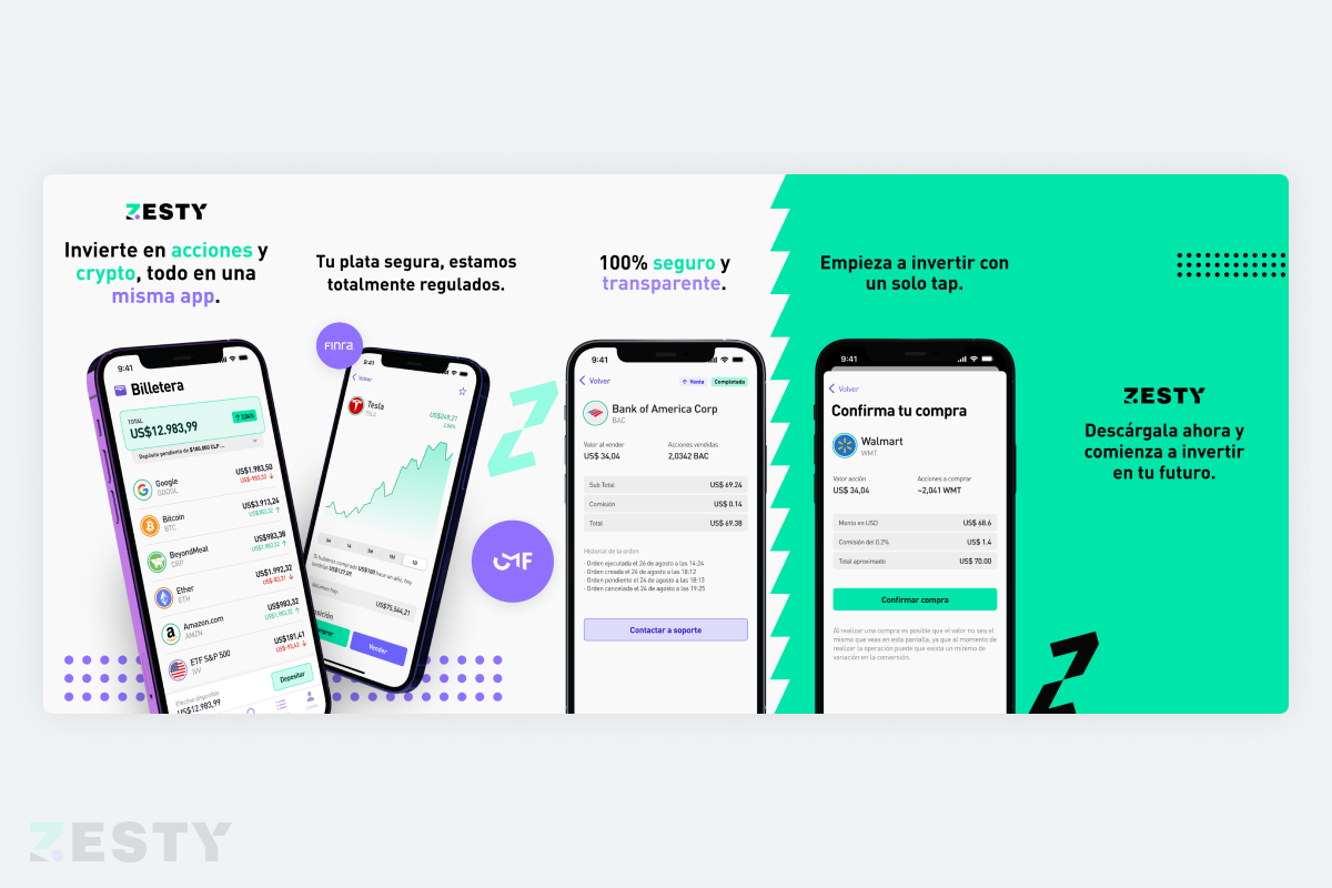
The objective was to create a simple yet informative landing page that would effectively communicate the essence of Zesty, and encourage users to sign up and start investing. The main challenge was to strike the right tone of communication and present the key benefits of the platform in a clear and concise manner.
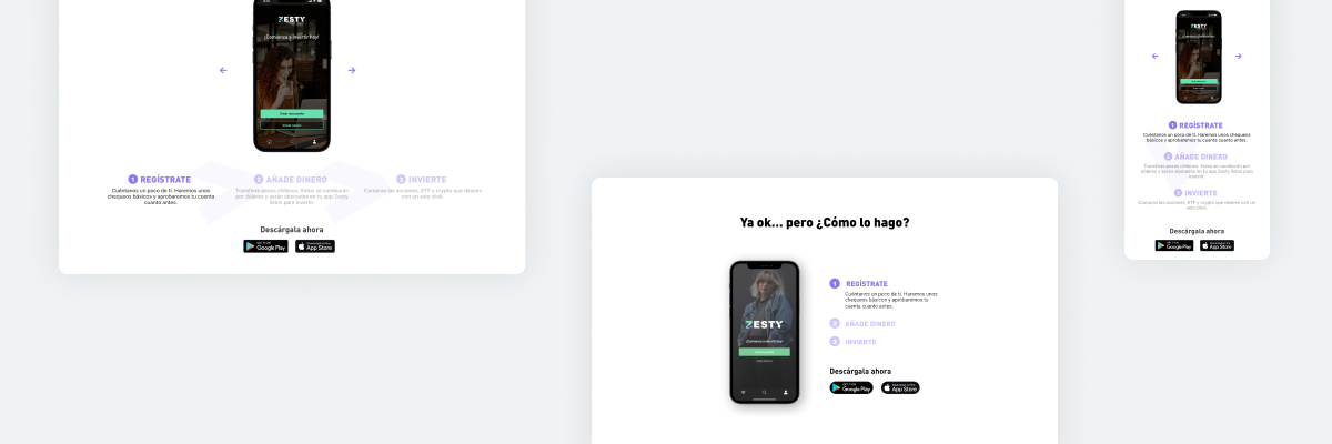
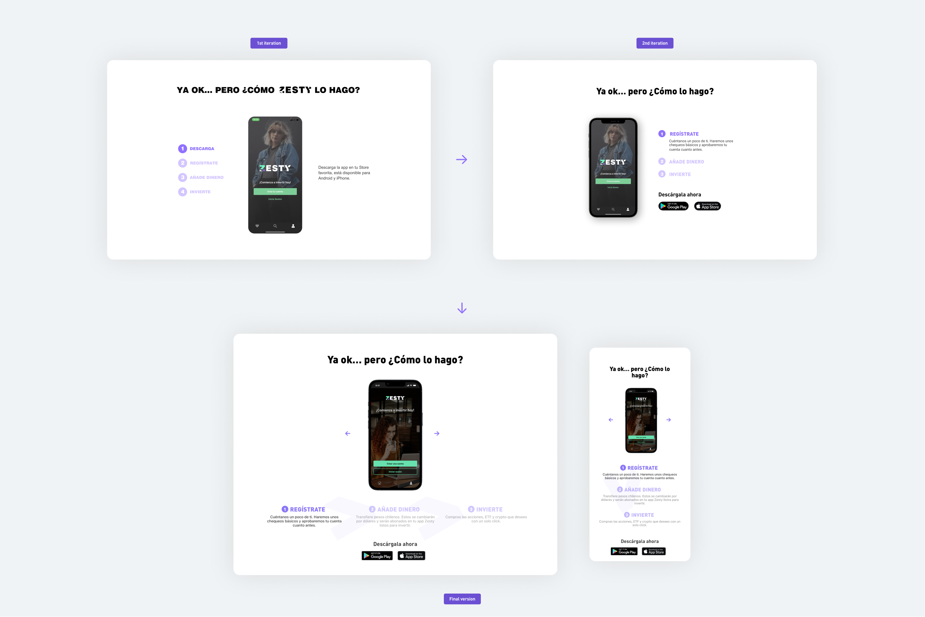
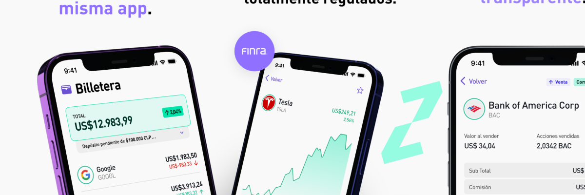
To address this challenge, we decided to use a slider that showcased the main sections of the app, and provide users with a brief overview of the features and benefits of the platform. We faced some difficulties in selecting the most relevant screens for the slider, but after several iterations and user interviews, we narrowed down to the core functions of the platform that included easy sign-up, share acquisition, and wallet management.
As a UX designer, I was committed to ensuring that the layout of the landing page was visually appealing and user-friendly. We incorporated the Slick.js slider, made some adjustments, and added micro-interactions that enhanced the user experience. This resulted in a stunning landing page that effectively communicated the essence of Zesty.
Mailing
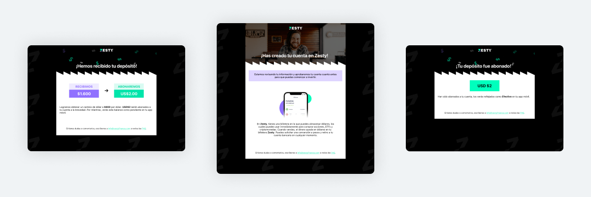
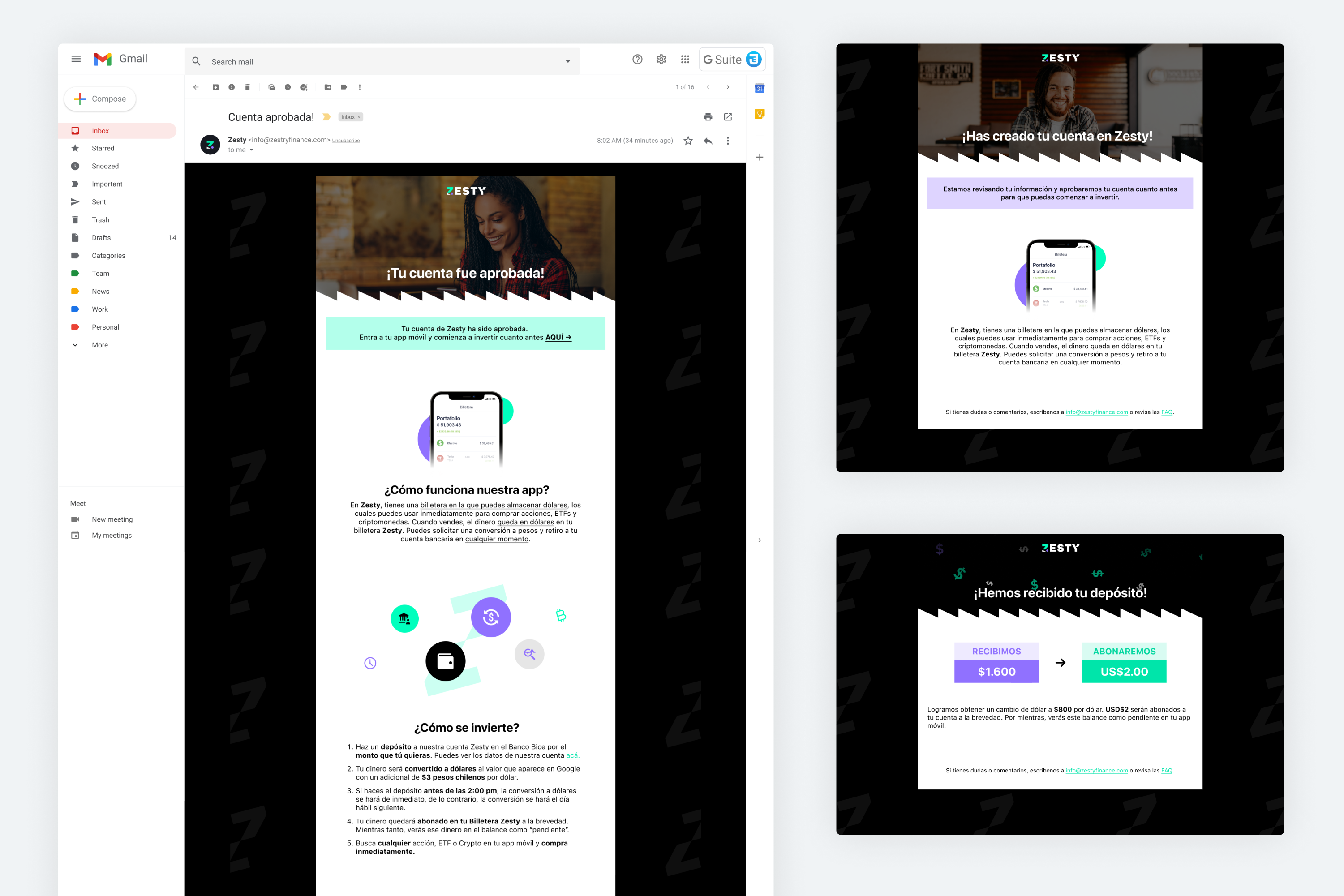
After completing the landing page, I was tasked with designing and coding transactional and informative emails for the platform. These emails were crucial in providing users with relevant information after they had signed up and started investing. I curated the content, designed and coded the emails, and made adjustments in the HTML to ensure that the information was easily visible on mobile devices.
App
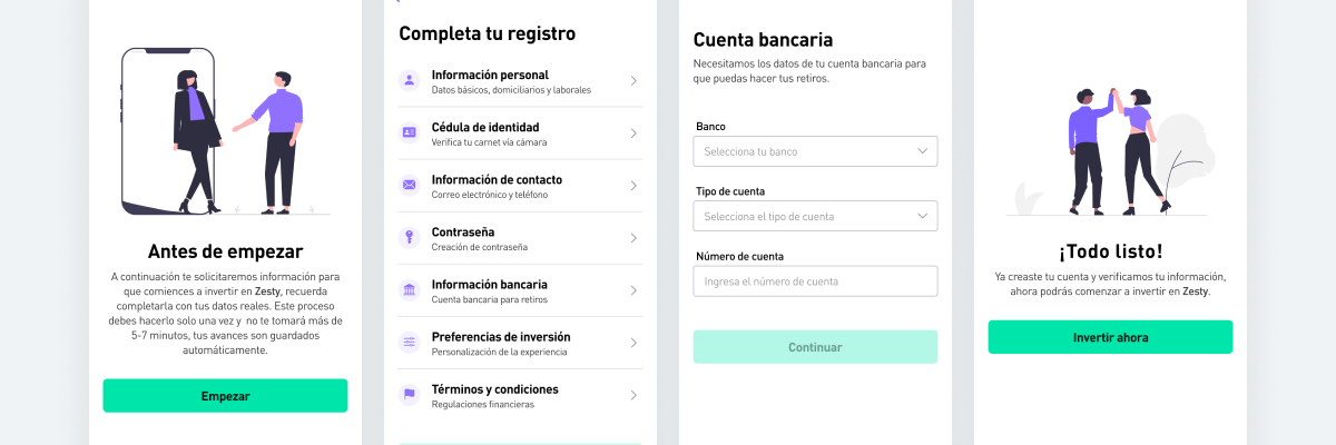
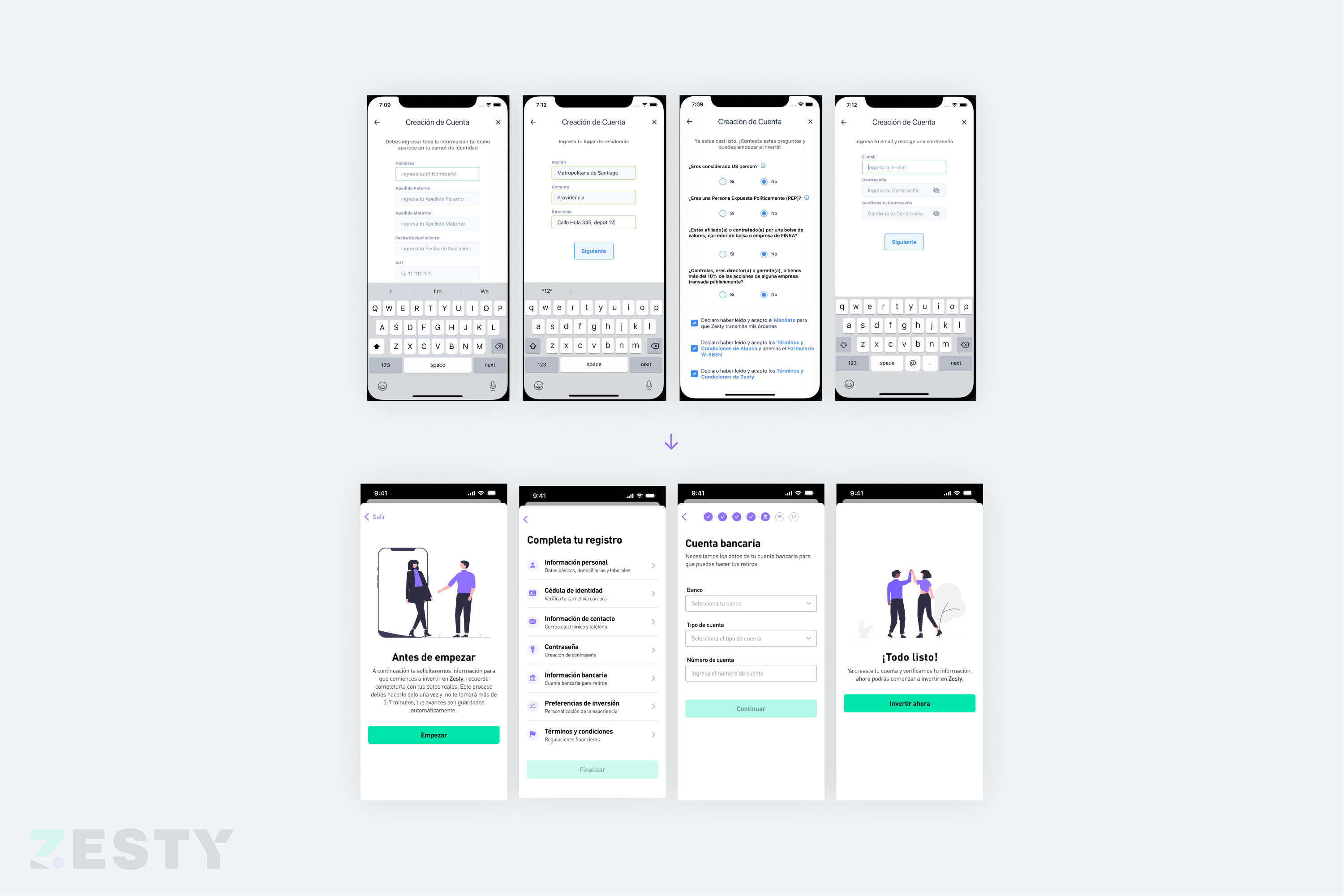
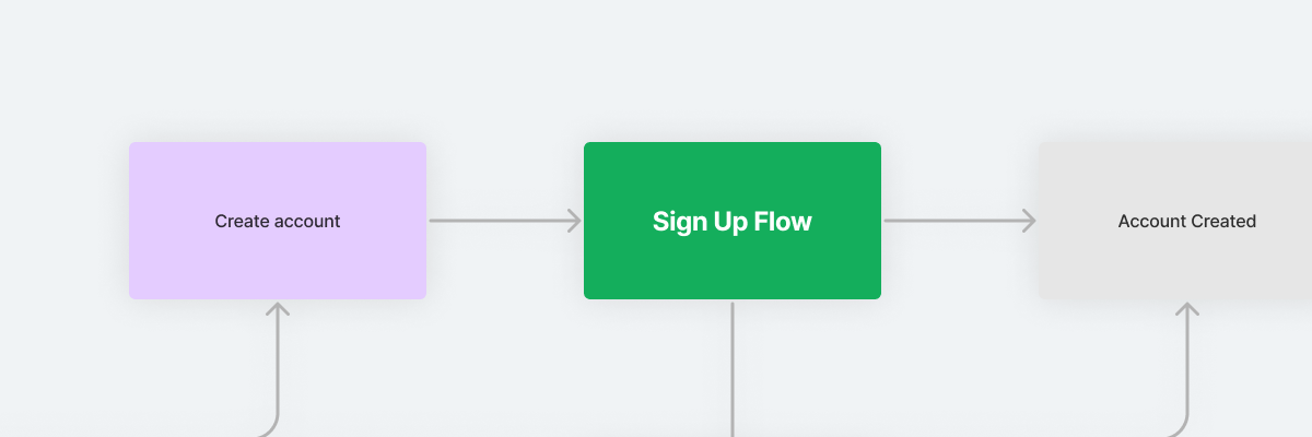
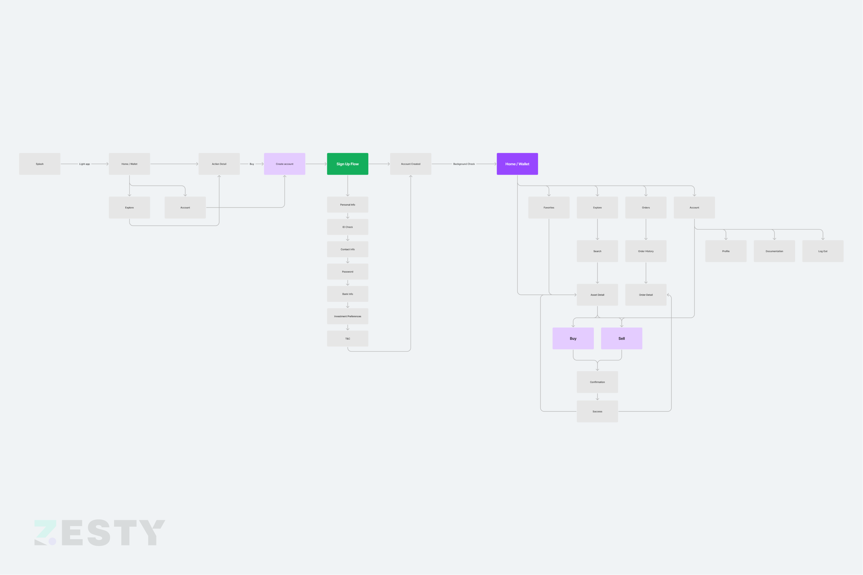
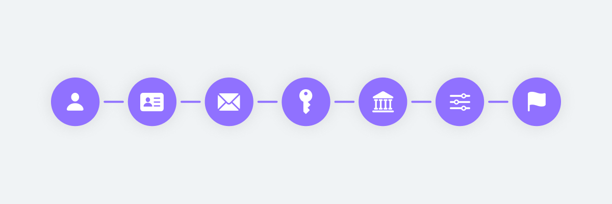
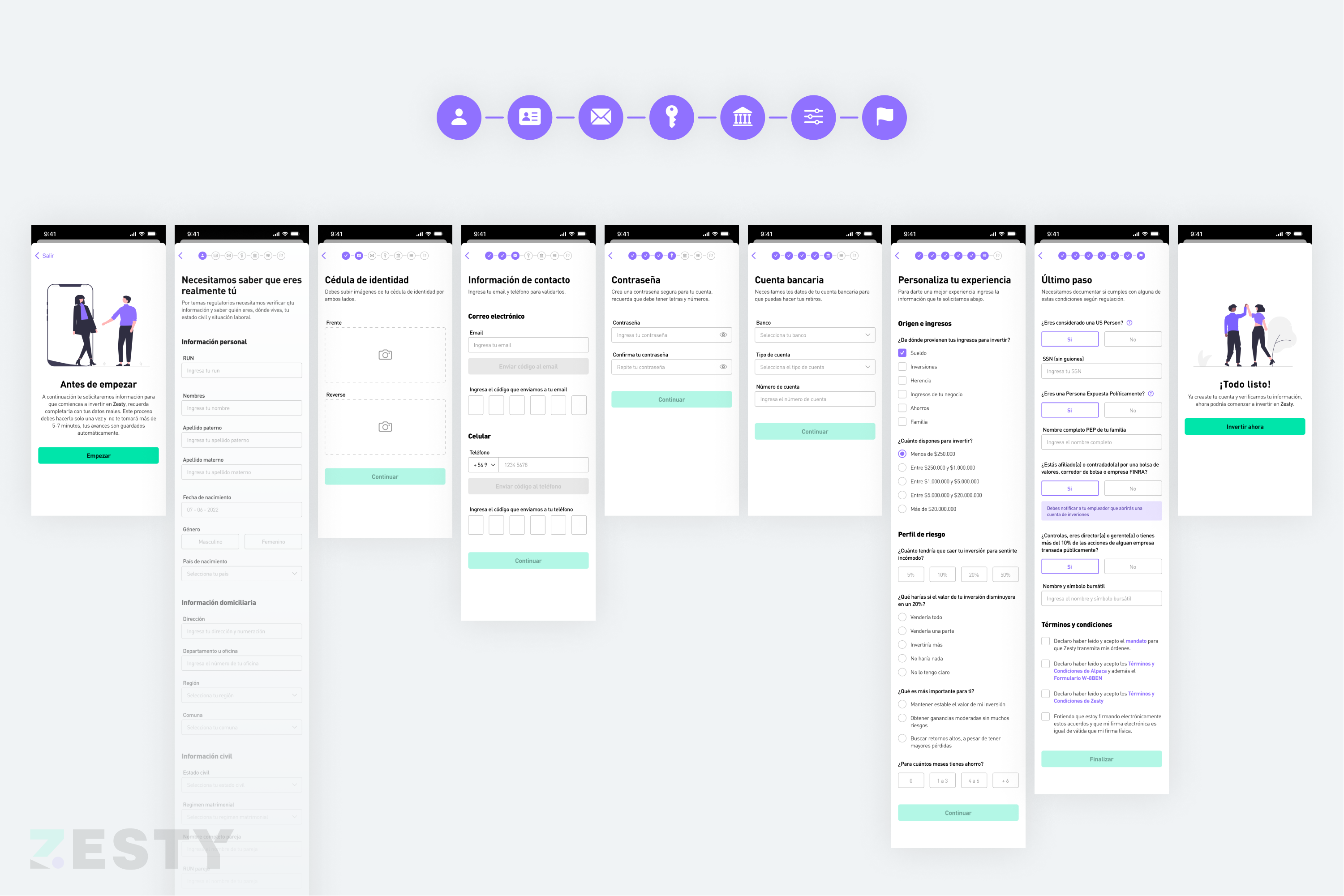
The next challenge was to improve the usability of the Zesty app, specifically the enrollment process, which users found difficult to complete. Our research showed that users needed more information and guidance during the process, and so we worked on an idea that highlighted the enrollment process through steps or stages completed, using iconography to guide users and inform them of their progress.
This approach significantly improved the signup conversion rate and received excellent feedback from users. Although the enrollment process still had many mandatory steps, it was now easier to complete, and users appreciated the ability to save their progress and finish the process later. The Zesty app continues to evolve, and we remain committed to improving the user experience and making it easier for users to invest in stocks, cryptocurrency, and ETFs.
Onboarding & Sign-Up Experience 2.0: Streamlined & Enhanced
Recently, an update has just been released with a new onboarding and registration experience. I will soon tell you more and post updates.
It will continue…
– 16-07-2023 –
